http://www.topalbumcovers.com/98to91.html
show what has influenced your draft designs from existing examples from your genre
Photos
Artwork
Designs
Effects
As a mood board show where your ideas for your drafts have come from & how you have been influenced by existing examples of album covers and digipaks.
Tuesday 15 November 2011
Monday 7 November 2011
Digipack analysis tasks: video commentary
See example http://www.youtube.com/watch?v=vUOlOmNDMu4
- What are the conventions of the form and layout of a digipack?
- Discuss the Design of the: front, back, spine, what the images represent, how it relates to the artist, is it following conventions (feature the artists etc).
- How has it been photographed/drawn/colours/photo-effects - what could this mean/symbolise?
- How does it re-enforce/continue the construction of their Image?
- How do they contain conventions of the Genre of music?
Looky here...It's a digipak analysis!
This is the debut solo album from Babyshambles front man, Peter Doherty. Released March 16th 2009, the album did not sell as well as was predicted - only reaching 17 in the top 40 album chart. However, rock/indie magazine 'Q' stated the album was impressive and awarded it 4/5. The Guardian also gave positive reviews and claimed that this album says "Goodbye to Pete Libertine the Rehab King, and say hello to Peter Doherty, outstanding singer-songwriter and charismatic poet-vagabond. It's a pleasure finally to meet him". Pete Doherty has always excelled himself with lyrics, even with former band 'The Libertines'. Being a fan of Doherty, i may be bias in saying that i think the album exceeded my original expectations and even though Doherty’s voice has been damaged by drug use, these tracks are poignant and meaningful. This digipak consists of the audio CD, DVD of extra performances, and a booklet in the centre with illustrations and lyrics. It is made from a rigid glossy card material.
Here is the front cover
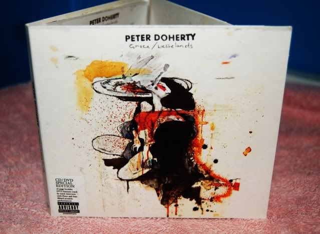
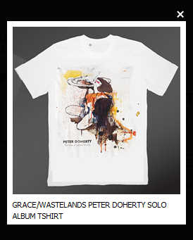
We are initially struck with this imposing graphic design image of a woman with a burnt orange/brown/yellow colour scheme that runs throughout the digipak. This is also the design sold on t shirts to launch the album and his solo career, using this deisgn will allow people to realise it is from this album!
The fact that Doherty isn't on the front cover i would say is slightly inconventional however, more recently i think it has become more common for artists to do this, but then have some kind of image of themselves inside the package. (which we then go on to see) His name is in capitals but the font is quite small and therefore your eye is not drawn straightway to this, underneith is the name of the album 'Grace/wastelands' which is in a fine handwritten style font (handwritten being the style we have also gone for) but could be easily missed at a glance! The parental advisory sticker on the front along side the informative 'CD/DVD special edition' is recognisible with regard to CD packages and therefore know there will be strong language either on the CD or DVD.
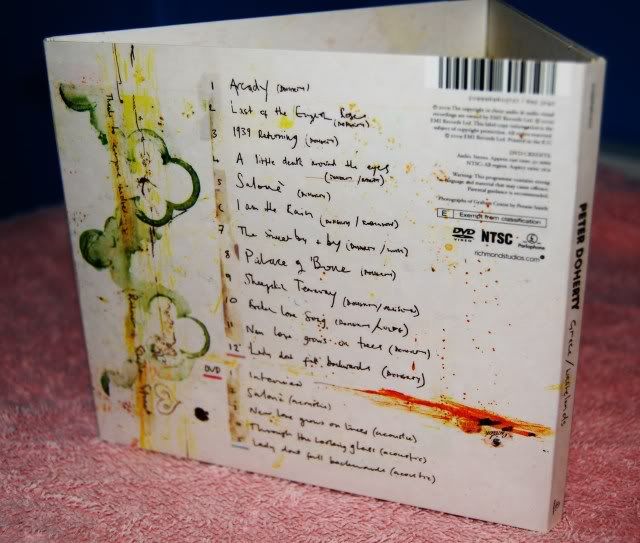
This is the backcover of the digipak, once again keeping to the graphic design colour scheme and the handwritten names of the tracks particuarly stand out to me, because this is a key feature i think works with this individual artist - it creates more of a personal touch! :) Another thing i think we haven't mentioned until now is the barcode!....we need to include that! otherwise how would people buy our wonderful digipak!...here it is at the top right, slightly inconventional (as it is usually in either of the bottom corners) BUT i like it!
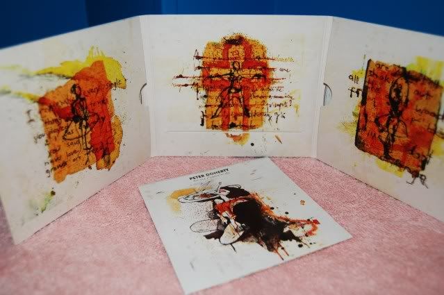
Here is the entire digipak opened up, and the front cover of the booklet inside which has song lyrics (handwritten) and further graphics. Each panel inside commits to the recurring colour scheme but has 3 images of a ballet dancer, which is relevant to one of the songs (and could also be relevant to the dancers her had at his live shows) Some lyrics from the tracks are also written across these designs again in a handwritten manner which i think works well!
To either side of the centre panel you can see the slots for the CD and DVD and at the bottom of the centre panel there is a long slot where the booklet goes, i think this is a very neat and well processed design!
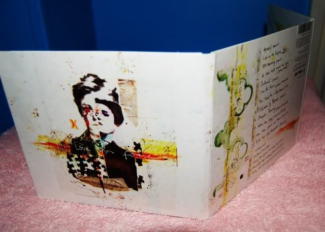
This digipak has an extra panel (similar to ours!) which has yet another illustration, this time of Doherty himself (even though slightly distorted!) i like the black jigsaw pieces that make up part of his torso, its kinda quirky! :)
Finally, here is a photo of the spine - this is a very important aspect of the digipak design because most CD/DVD holders only show this part and therefore needs to be easily accessed and recognised

This one clearly displays the artist and album name, overall i think this is a good example of a digipak for an individual artist, my favourite features being, the handwritten fonts and the general layout :)
Thanks for reading, Lorna.
Here is the front cover

We are initially struck with this imposing graphic design image of a woman with a burnt orange/brown/yellow colour scheme that runs throughout the digipak. This is also the design sold on t shirts to launch the album and his solo career, using this deisgn will allow people to realise it is from this album!

The fact that Doherty isn't on the front cover i would say is slightly inconventional however, more recently i think it has become more common for artists to do this, but then have some kind of image of themselves inside the package. (which we then go on to see) His name is in capitals but the font is quite small and therefore your eye is not drawn straightway to this, underneith is the name of the album 'Grace/wastelands' which is in a fine handwritten style font (handwritten being the style we have also gone for) but could be easily missed at a glance! The parental advisory sticker on the front along side the informative 'CD/DVD special edition' is recognisible with regard to CD packages and therefore know there will be strong language either on the CD or DVD.

This is the backcover of the digipak, once again keeping to the graphic design colour scheme and the handwritten names of the tracks particuarly stand out to me, because this is a key feature i think works with this individual artist - it creates more of a personal touch! :) Another thing i think we haven't mentioned until now is the barcode!....we need to include that! otherwise how would people buy our wonderful digipak!...here it is at the top right, slightly inconventional (as it is usually in either of the bottom corners) BUT i like it!

Here is the entire digipak opened up, and the front cover of the booklet inside which has song lyrics (handwritten) and further graphics. Each panel inside commits to the recurring colour scheme but has 3 images of a ballet dancer, which is relevant to one of the songs (and could also be relevant to the dancers her had at his live shows) Some lyrics from the tracks are also written across these designs again in a handwritten manner which i think works well!
To either side of the centre panel you can see the slots for the CD and DVD and at the bottom of the centre panel there is a long slot where the booklet goes, i think this is a very neat and well processed design!

This digipak has an extra panel (similar to ours!) which has yet another illustration, this time of Doherty himself (even though slightly distorted!) i like the black jigsaw pieces that make up part of his torso, its kinda quirky! :)
Finally, here is a photo of the spine - this is a very important aspect of the digipak design because most CD/DVD holders only show this part and therefore needs to be easily accessed and recognised

This one clearly displays the artist and album name, overall i think this is a good example of a digipak for an individual artist, my favourite features being, the handwritten fonts and the general layout :)
Thanks for reading, Lorna.


http://www.virginmedia.com/music/pictures/toptens/best-album-covers-ever.php?ssid=18
PLEASE LOOK!!! SENIOR EXAMINERS BLOG WITH EXAMPLES
http://ocrmediastudies.weebly.com/g324-a2-coursework.html
Tuesday 1 November 2011
Goodwins Analysis - Research
see example of how to present your analysis covering the 7 areas
Download the video from youtube (same genre would be useful!)
You could add titles over the stilled relevant sections with your analysis
or you could use the green screen to present to Camera with the video behind you
or
you could record a commentary freezing over the relevant sections
http://www.youtube.com/watch?v=WQJlWbjndp4


Class examples we have looked at

risk assessment example
http://www.reelfilmlocations.co.uk/files/Risk%20Assessment%20Form.pdf
ensure you have a production company name please for your team - make sure this is on your blogs!
Thanks
Mr.B
ensure you have a production company name please for your team - make sure this is on your blogs!
Thanks
Mr.B
Subscribe to:
Posts (Atom)